Right now, I'm working on getting this ninja's jaw to look like it's exploding out of his mask properly. I'm also trying to see if making him blue instead of red will look any good, in an attempt to make the blood and fire stand out more. If I can't get him to look just right, I might just leave it as-is.
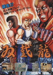
In addition to the Double Dragon II piece, I took some inspiration from Machine Gun Willy in this flyer for the first Double Dragon:

So far we've had a pretty positive response from /r/comics on Reddit. However, /u/stopmotionporn did voice some concern:
"How is the cover a parody? Looks more like just plain imitation to me."
My rationale, in case anyone else is wondering the same thing: By ramping up the violence and T&A for comedic effect. If it doesn't shine beams of joy into your heart like it's been doing to me as I've been working on it, I guess its parody magic isn't as effective for everyone.
