I meant to post this sooner, but I actually got caught up reading our comic. Holy shit is it awesome.
Anyway, this weekend Jessica is putting the finishing touches on our revised Issue 01. Everything is done except for some lighting changes she plans to do tomorrow to the night scenes. All the Issue 1 pages on the site have been updated with the newest versions, but you might have to refresh the pages to see the update.
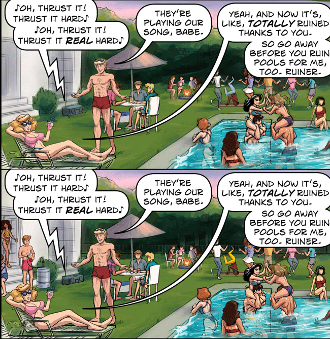
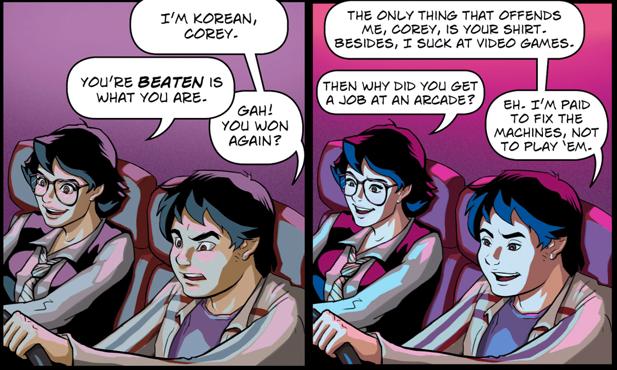
I already showed you a few comparisons of how the art has been updated in a previous post, but here's a bunch more.

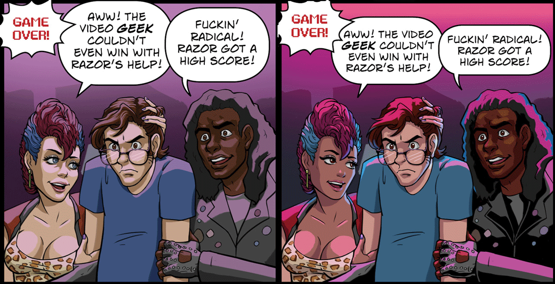
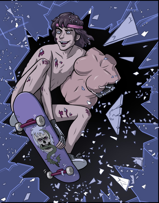
You can see the colors are now yummier, and so is Toxic's face (Toxic is the punk chick—the dude's name is Scorp, by the way). We decided to base her appearance more on a certain iconic punk chick that appeared in a couple classic '80s films.

This page was the only page to have substantial dialogue re-writes with this update. As you can see in this panel, we decided to leave Trance's race a little more ambiguous. Also, our idea of his character has evolved quite a bit since I first wrote this page, so we changed this panel to reflect that. And we both thought Alex looked kind of terrifying in this panel, so that needed fixing. We actually liked the way Jessica drew Trance in the original version, but it no longer made sense for his character to care at all about losing a video game, so he needed to look less intense and more care-free.


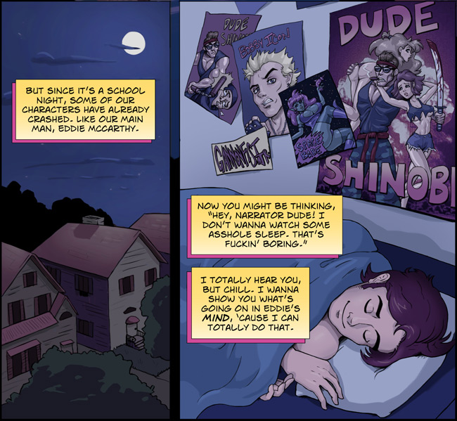
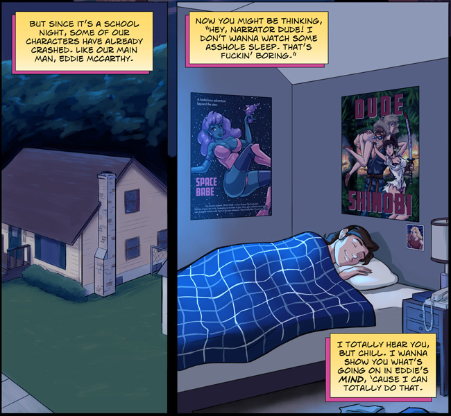
Here you see we totally revamped Eddie's house and his bedroom. One of the things I've done during this hiatus is designed Eddie and Alex's houses (including their yards). I'm not going to be so detailed for every character, of course, but both their houses play big roles in the comic, so the detailed floorplans I made up will be a big aid to Jessica. Originally, we had Eddie's room in the basement, but we've since decided to move him into the attic for various reasons. So until Issue 02 gets updated, there'll be a few panels that won't quite gel with this updated Issue 01 page.

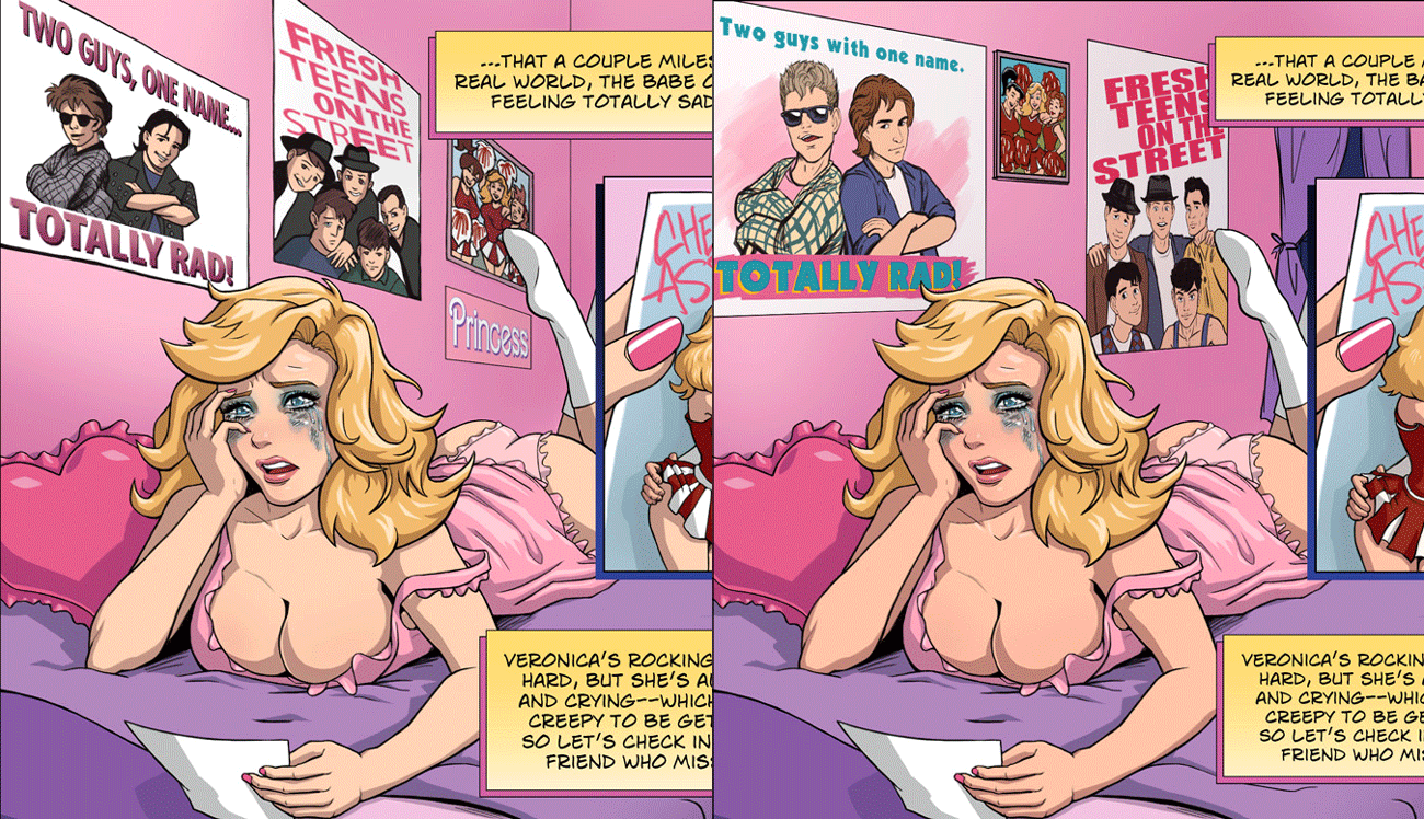
Veronica's room has also been updated. Jessica fixed the perspective, and redid the posters (and framed picture). Now the dudes in the posers look even more punchable! Awesome! Also, we decided to make Veronica a little less pasty.


Here you can see the evolution Psycho Sam has gone through since we started this comic. I think the only character that's been redesigned more than Sam is Ket. Anyway, now Issue 1 Sam finally matches his appearance in Issue 2.

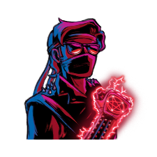
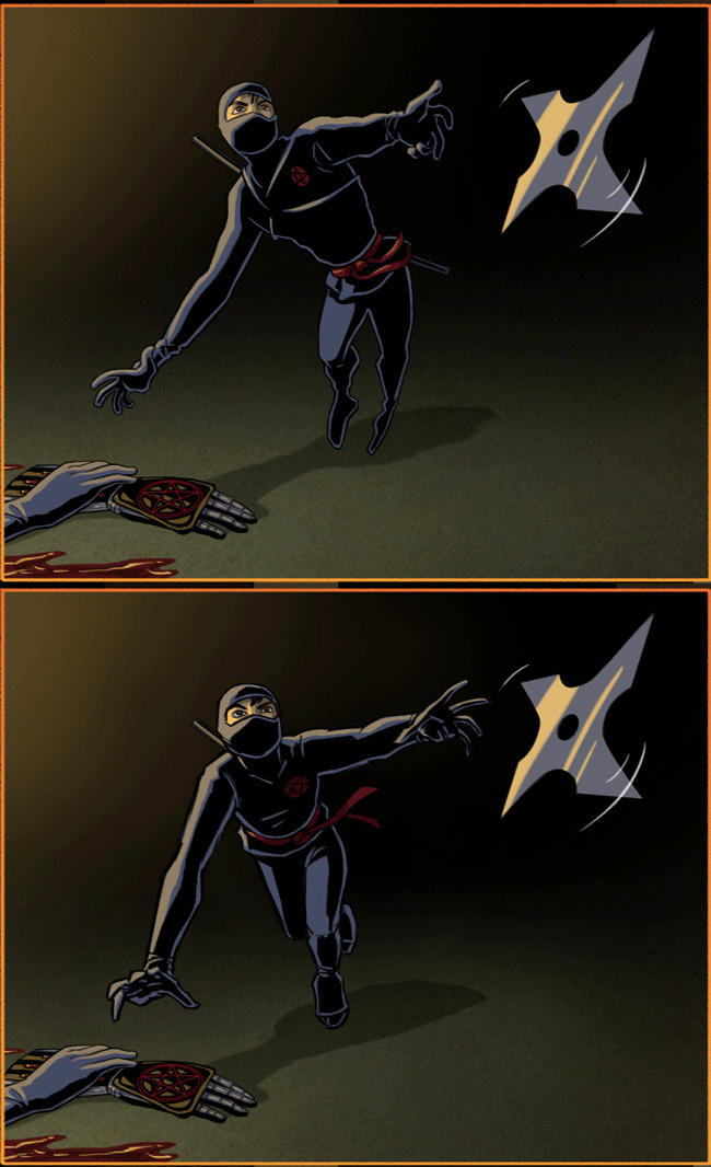
Jessica hated the anatomy on this ninja in the old version. She thought it looked like he was springing out of the ground, so she took this chance to quickly fix him.

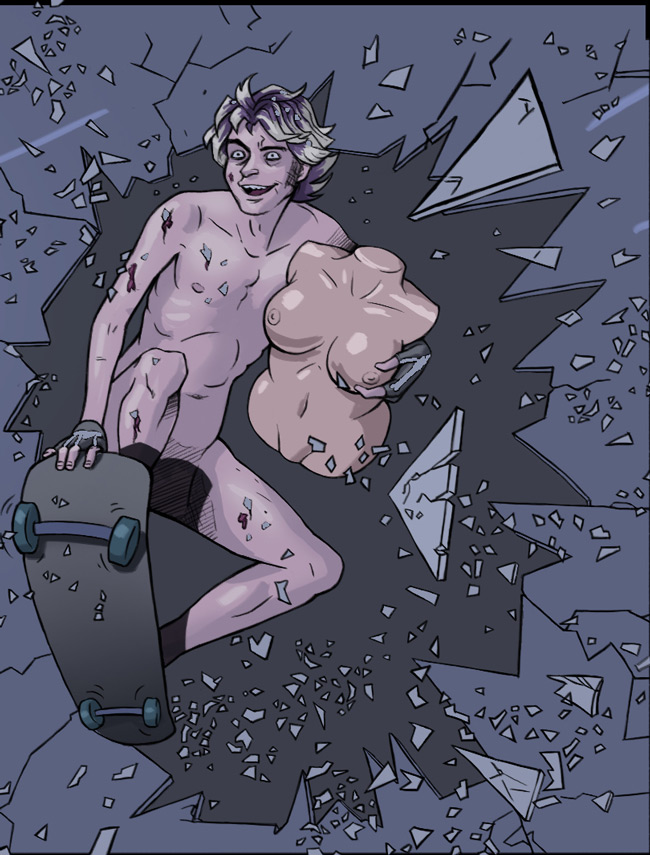
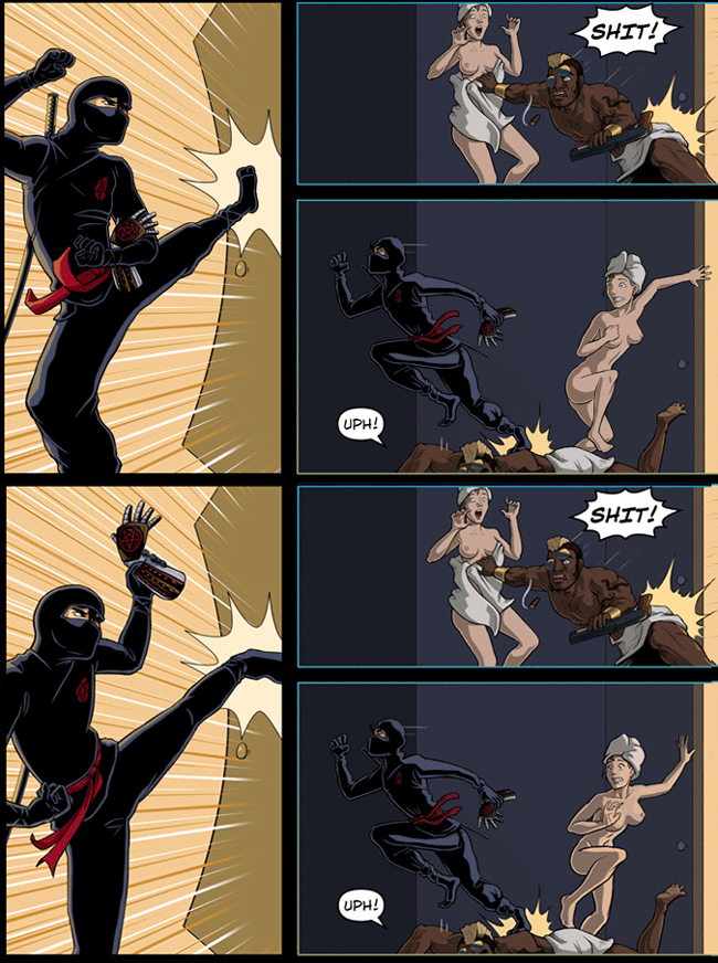
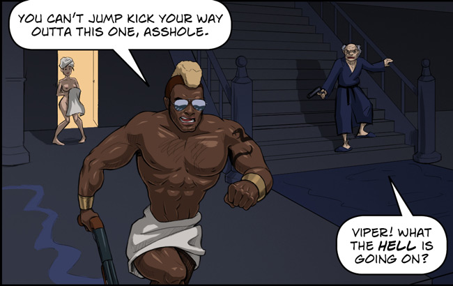
Again, some wonky anatomy that needed fixing. Both the ninja kicking the door and Jennifer's nudie dance of fear have been mega-enhanced.


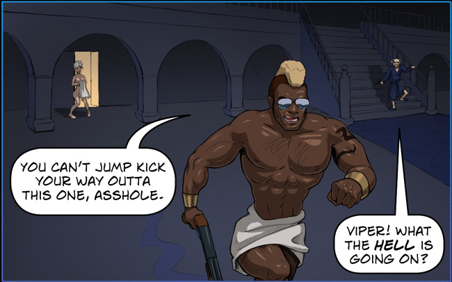
Jessica thought this shot of the Moore mansion interior looked way too vast. Also, I had originally made the odd choice of giving her pictures of the Resident Evil 1 mansion for reference, which is totally not '80s, I know. It was just the first mansion that came to mind when she had asked me for mansion reference pictures.
There are a bunch of other little changes to Issue 1, but those are the most noticeable ones.
 January 21, 2016 - 7:07pm by Adam Dravian
