 May 2, 2015 - 9:31pm by Adam Dravian
So while working on Issue 2, we decided to retcon the appearance of Sam's hair and Eddie's room. Because of this, we've known we'd have to go back and update a few panels in Issue 1. And we figured since we're updating some things anyway, we might as well take this hiatus as an opportunity to update anything in Issue 1 that we think could be improved. After all, Issue 1 will be people's first impression of the comic, so it's important that we make it as good as possible. Today, I thought I'd show you what some of these updates look like.
Warning: There are going to be some NSFW images posted here.

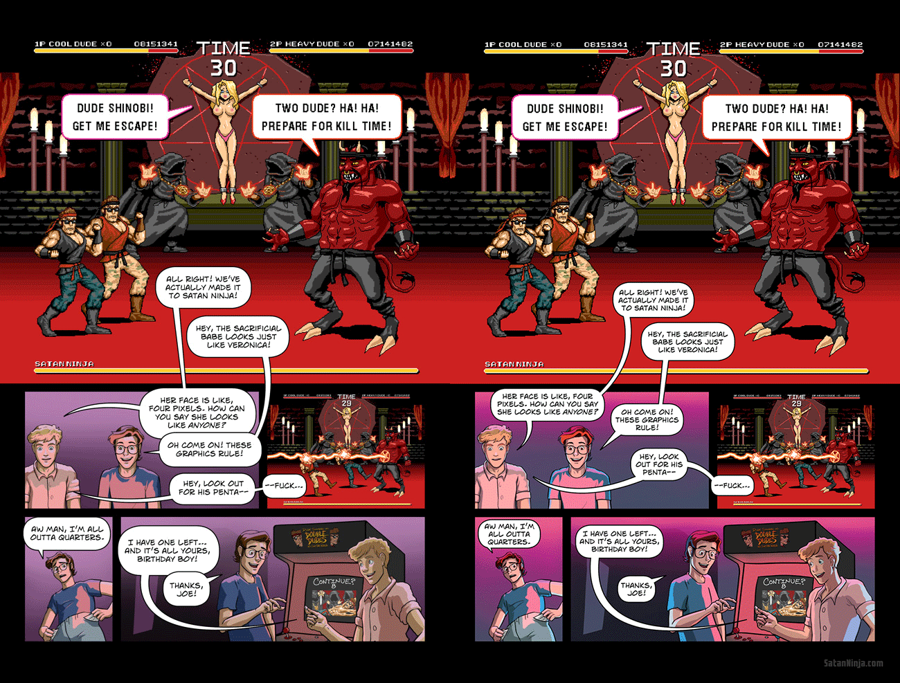
The most notable difference here is probably the colors of the arcade's lighting. Jessica thought the original purple color looked too '90s, so she gave it more of an '80s makeover. She also changed the way she shades the characters. And you can see that the text balloons have been totally redone to make it much easier to see who is saying what (Jessica redid every balloon in Issue 1, but this page has a more dramatic difference than most). And finally, we thought Joe was looking a little odd in the final panel, so Jessica redrew him.
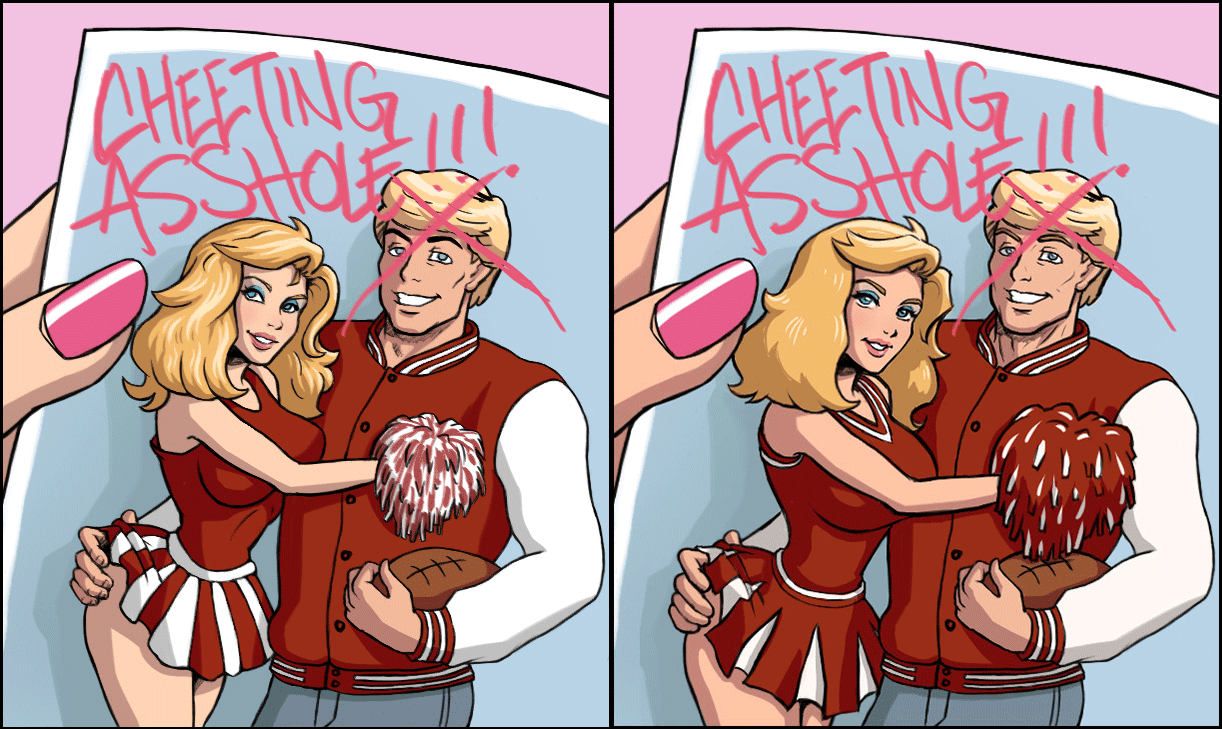
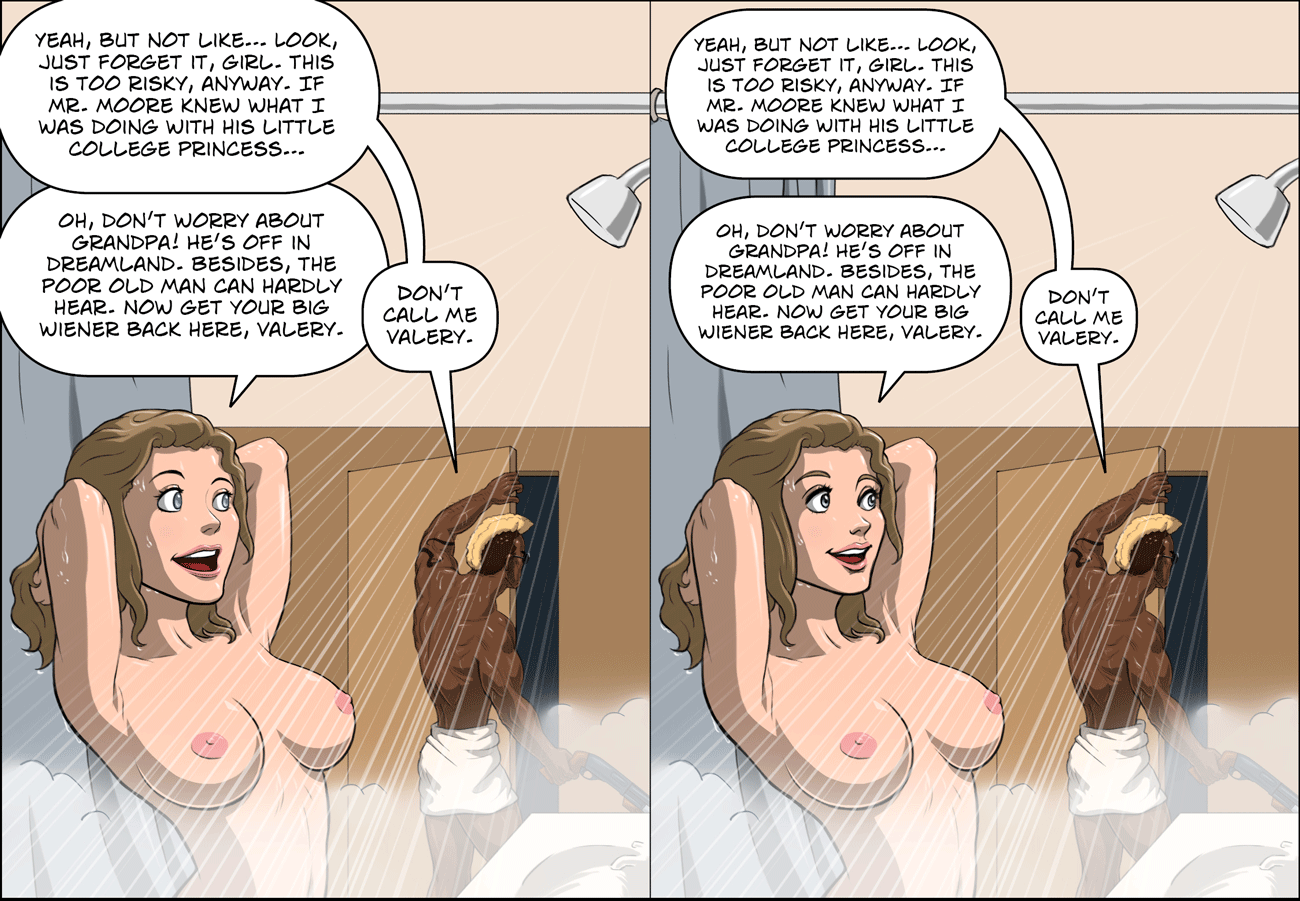
Here are a couple other examples of characters she's redrawn for this update.

The changes to Dean are very subtle, but Veronica is mega-improved.

And here you can see that Jennifer has a waaaay better face.
One of the biggest updates Jessica is making to Issue 1 is the cover, which we never felt satisfied with. Her updated version is looking rad as fuck, but she's still working on it, so we're not showing it yet.
Of course anyone who purchased the digital pdf of issue 1 from our store will be sent the updated pdf of issue 1 for free as soon as it's ready.

